See http://www.typografie.info/3/topic/35588-cutfont/
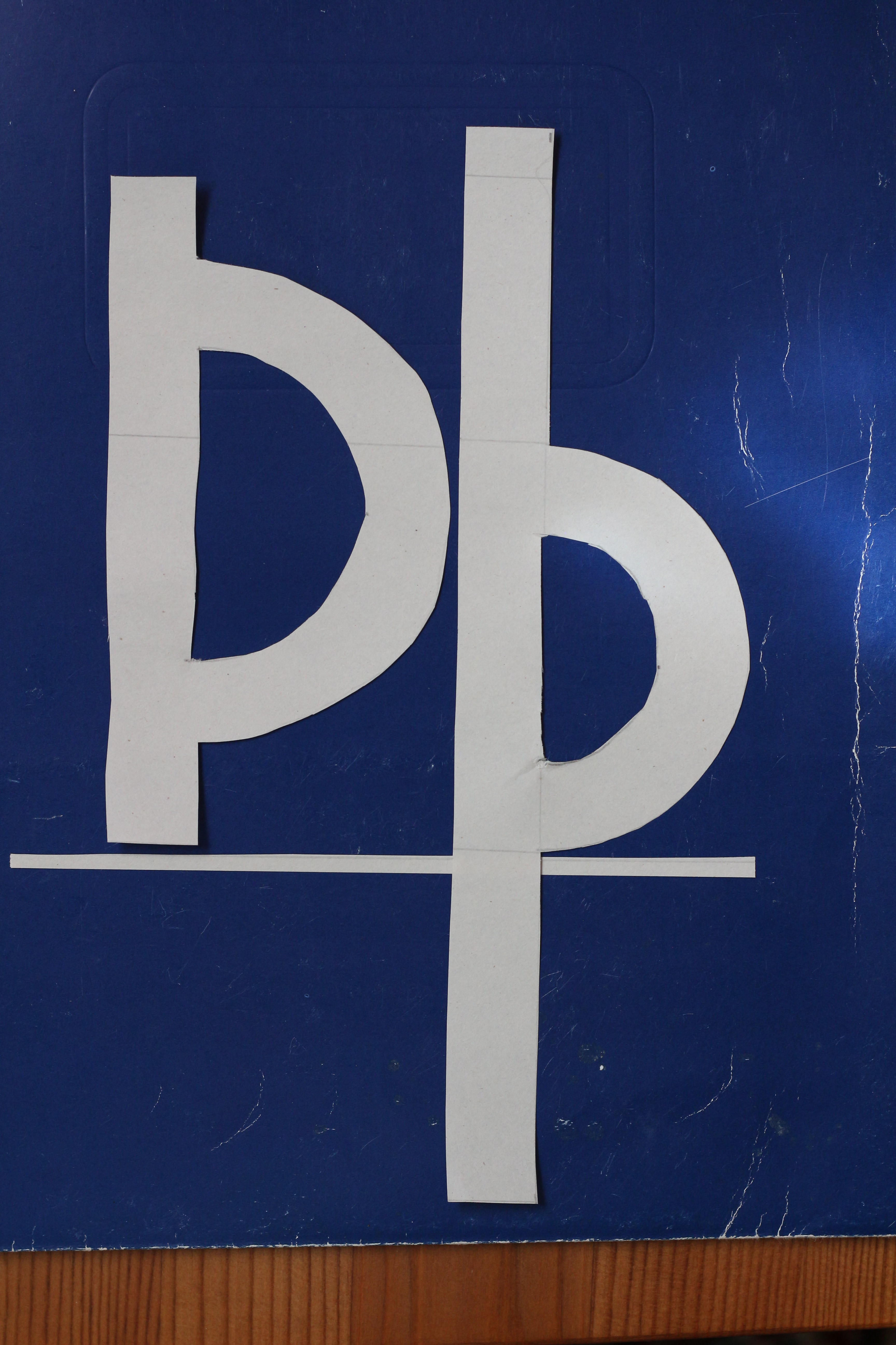
Letter forms can be pretty free-form, but better not mess with the basic proportions, especially the distictive heights of both cases, to keep Þ and þ easily distinguishable. To help achieve the desired rough and handmade look, only use tools found in the (non-office part of the) home: no compass, no ruler!
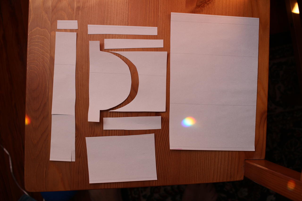
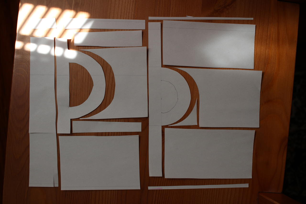
Since thorn’s vertical dimensions can be confusing, draw guidelines for ascender height, cap height, x-height, baseline, and descender height.
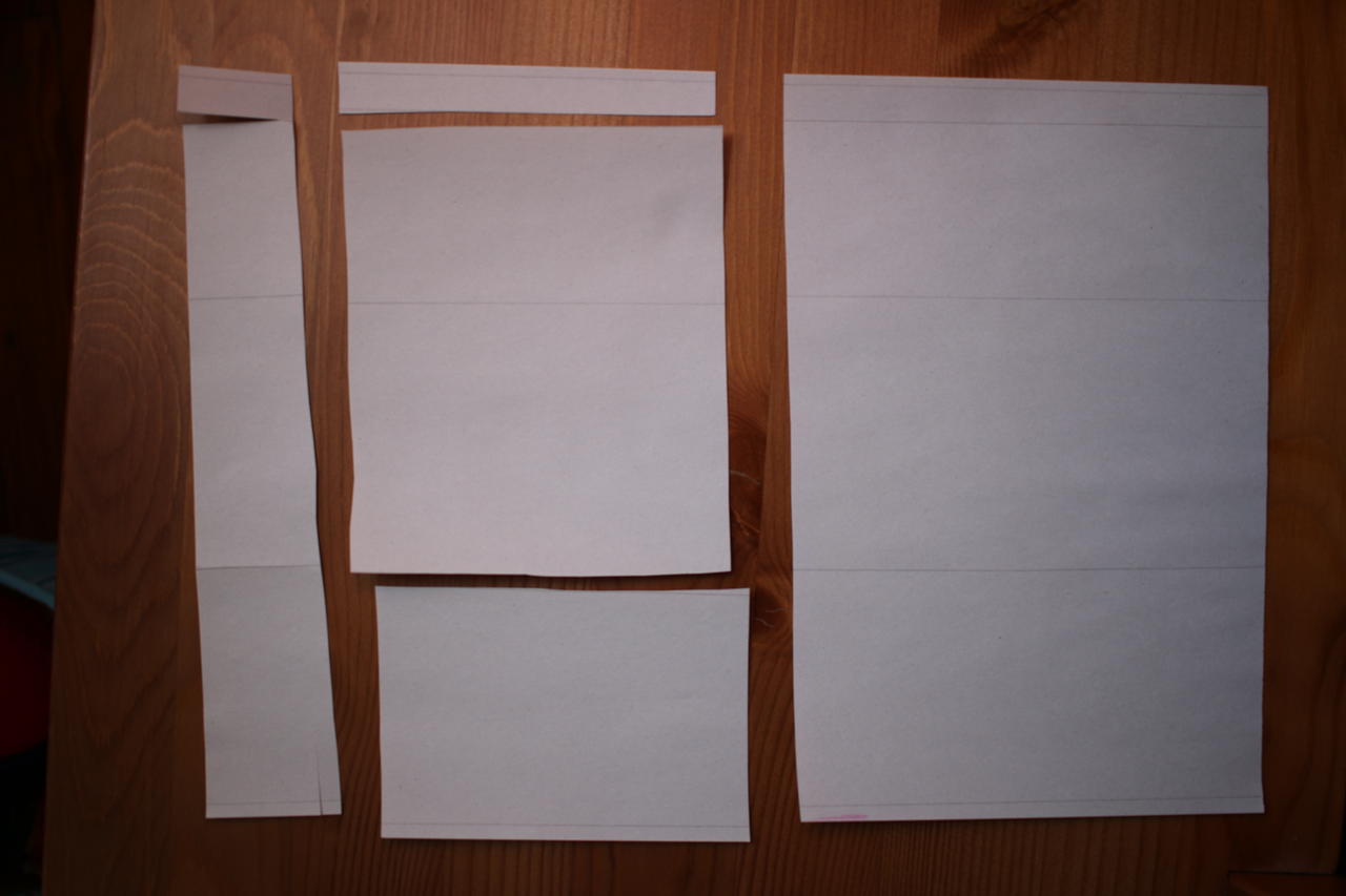
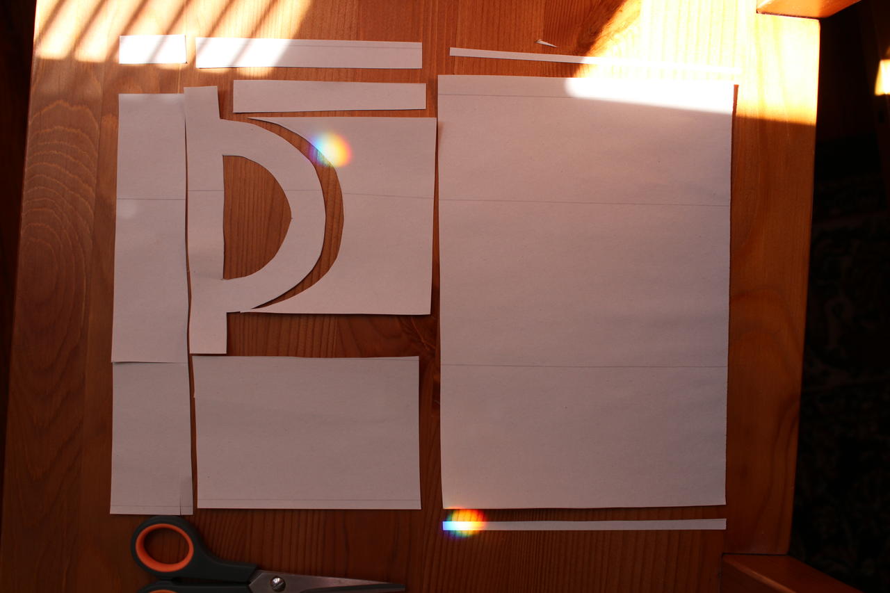
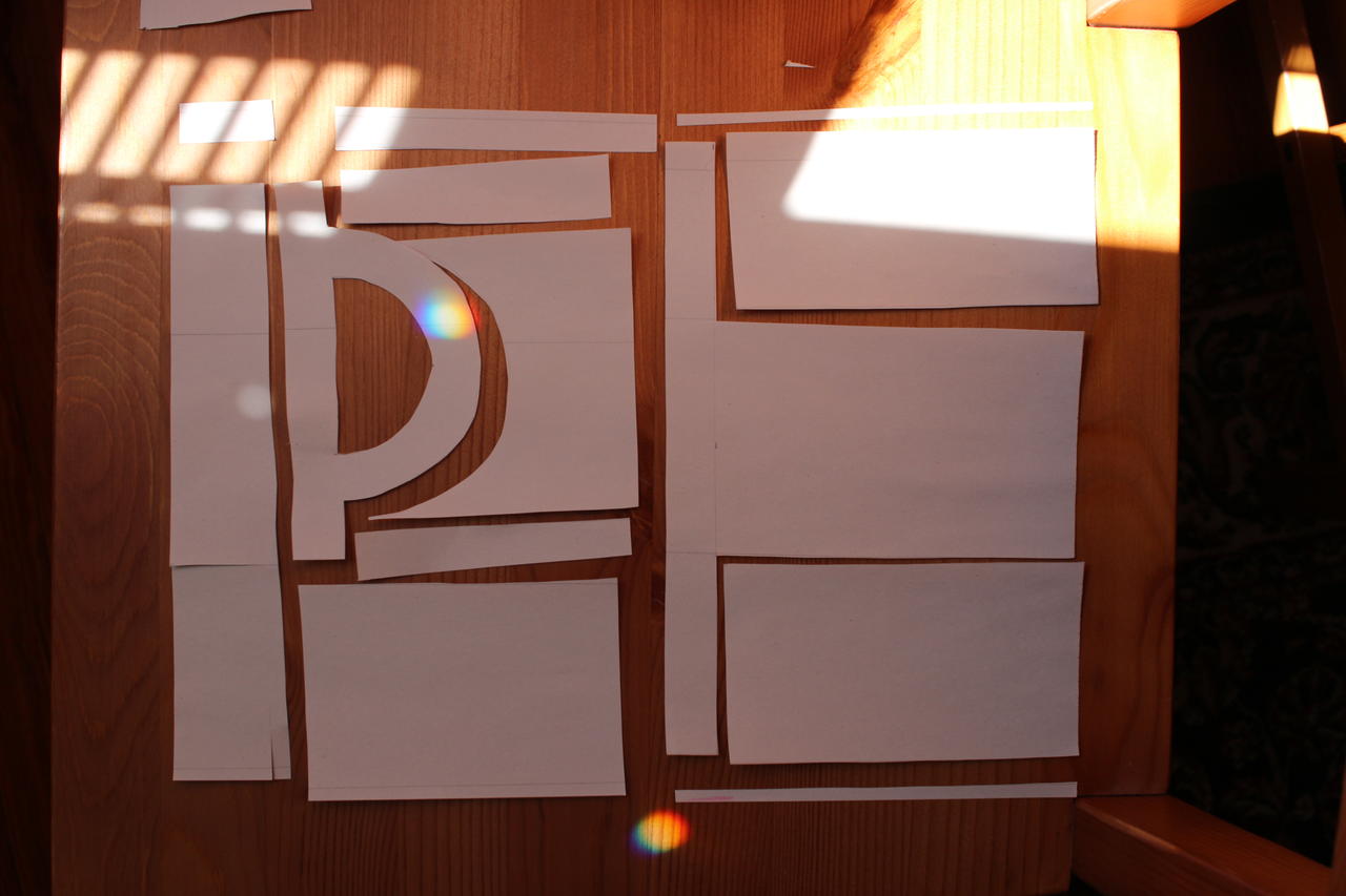
Make sure all edges are hand-cut.
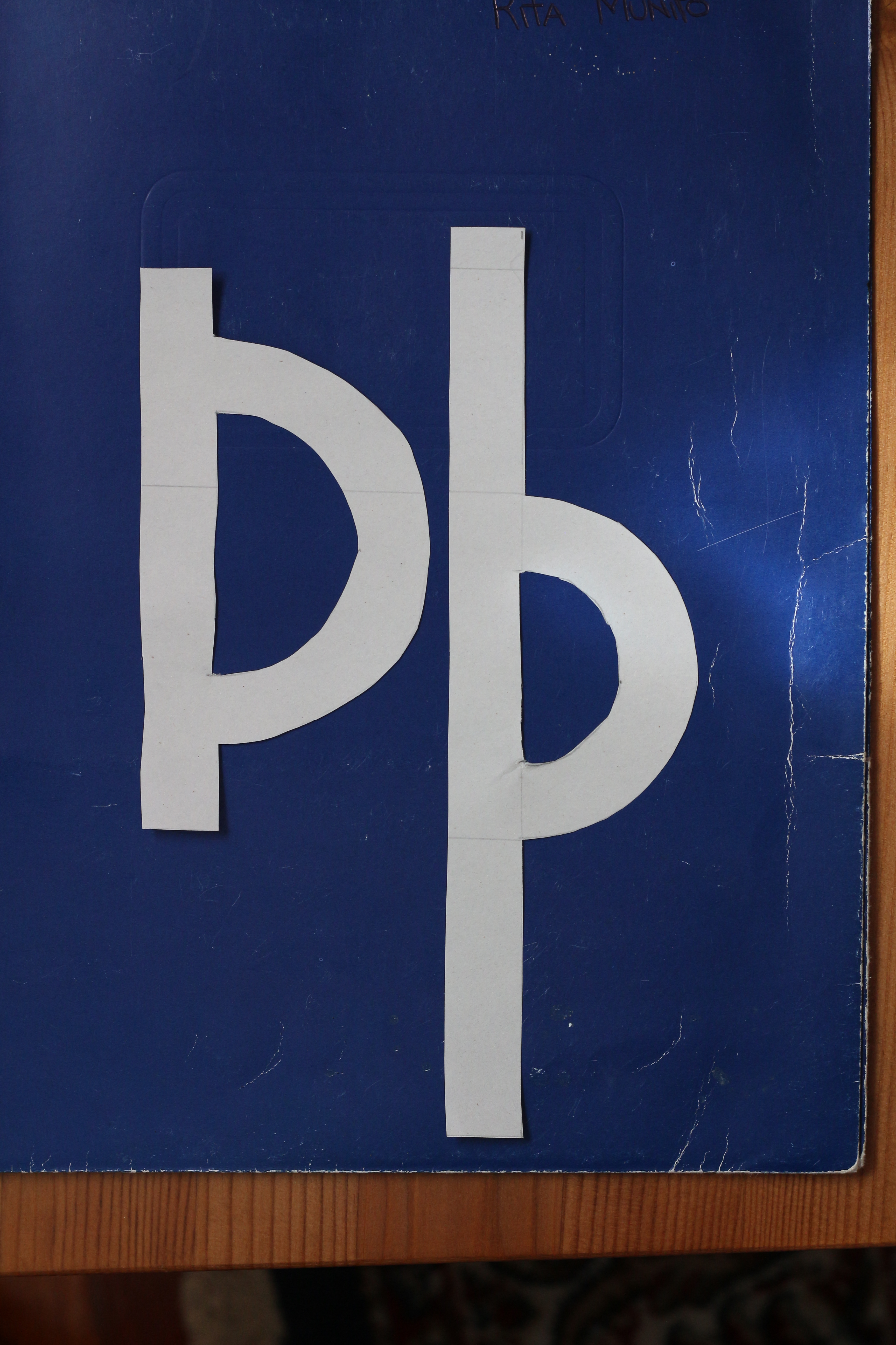
Þ reaches cap height from the baseline.
Hmm, weight? Just eyeball it!
For the very first attempt, better stay as simple (and geometric) as possible.
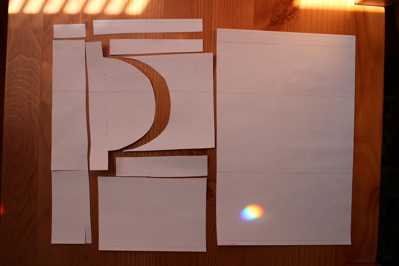
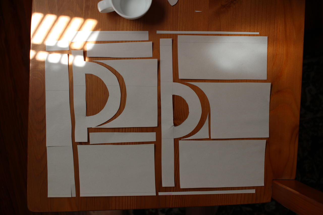
The sun came out! Never mind — and I’m not going to bother with white-balance either.
Lower-case þ reaches ascender and descender height!
Lower-case þ’s bowl extends from the baseline to x-height.
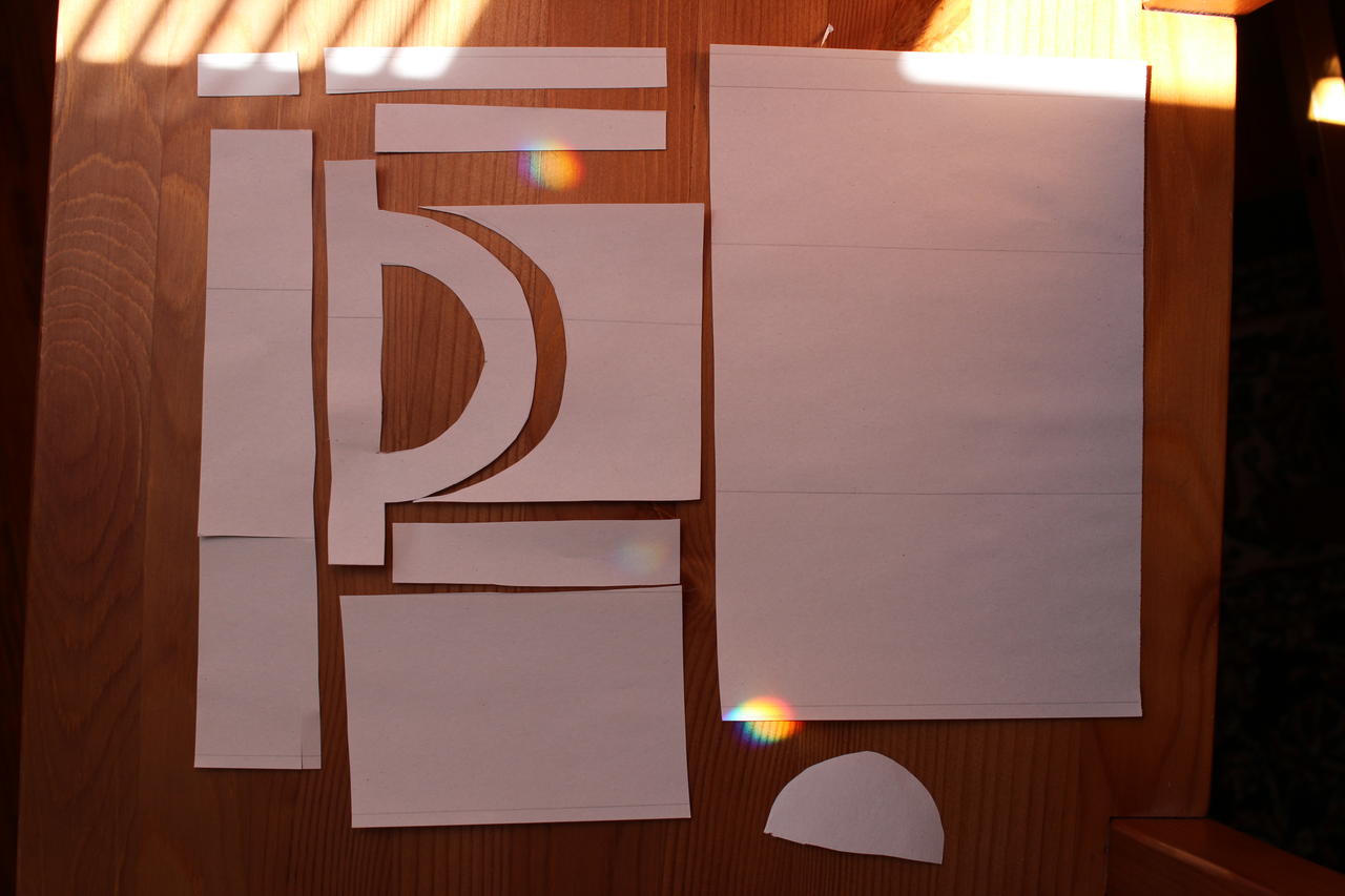
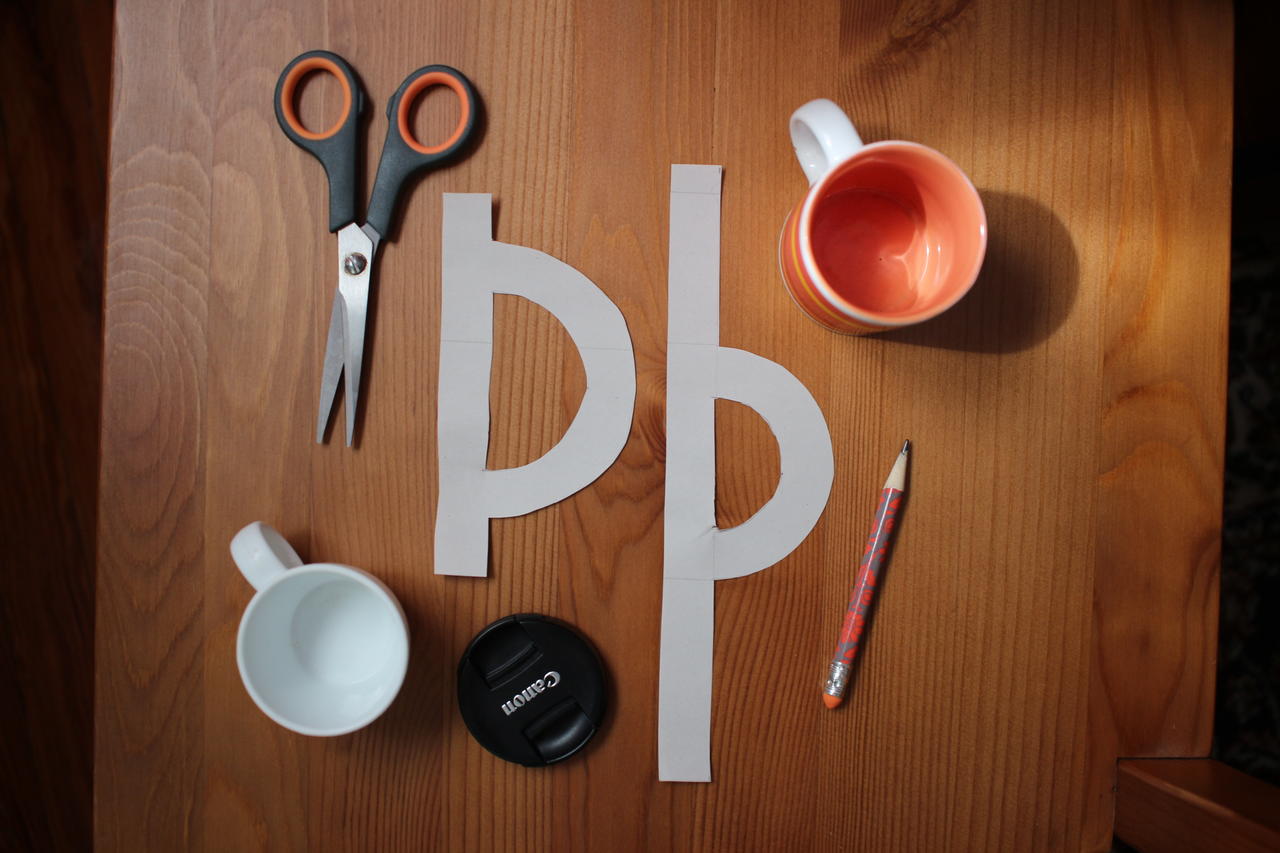
Remember the self-imposed no-compass rule? A toddler’s play cups work almost as well.
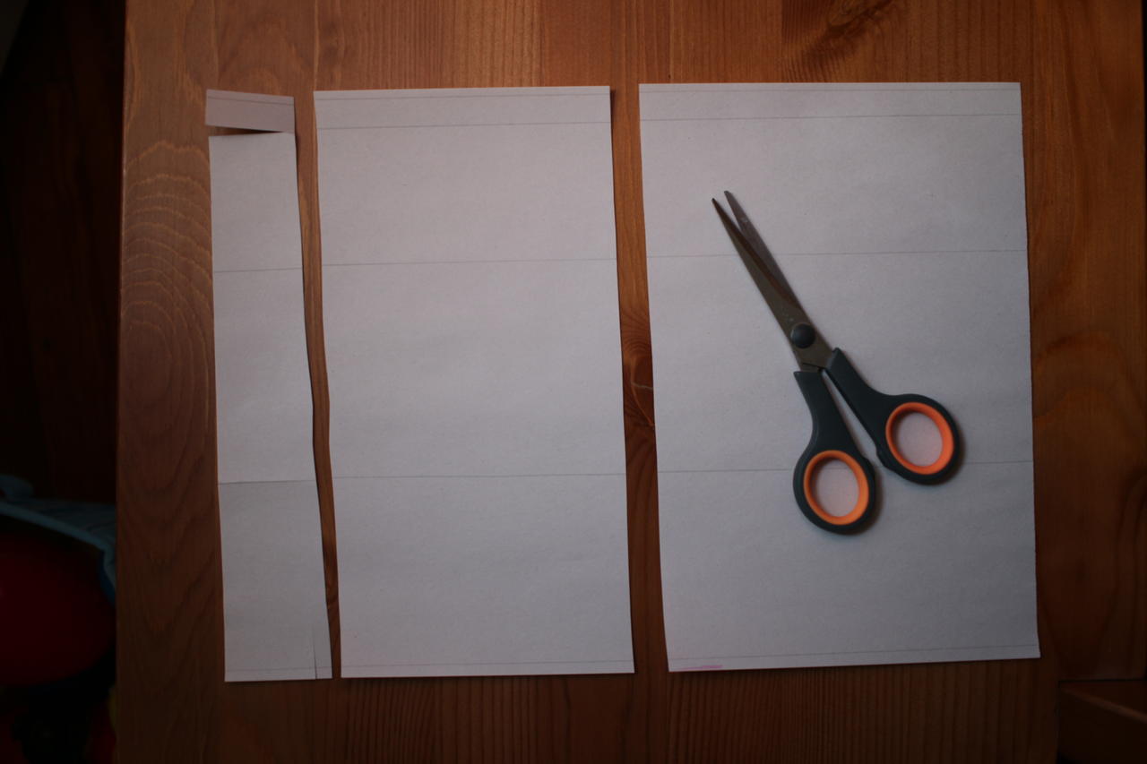
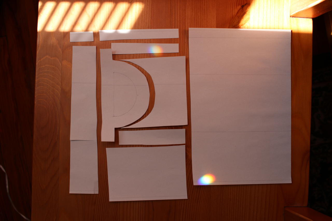
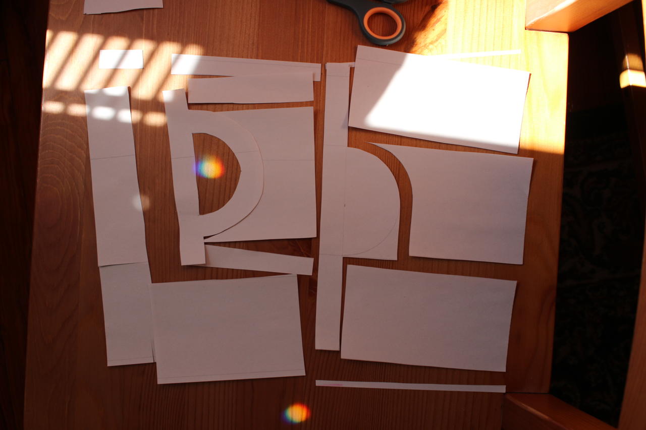
Tools used and finished cutouts
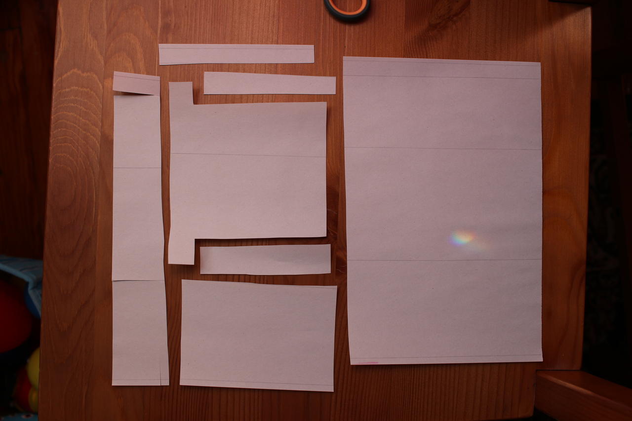
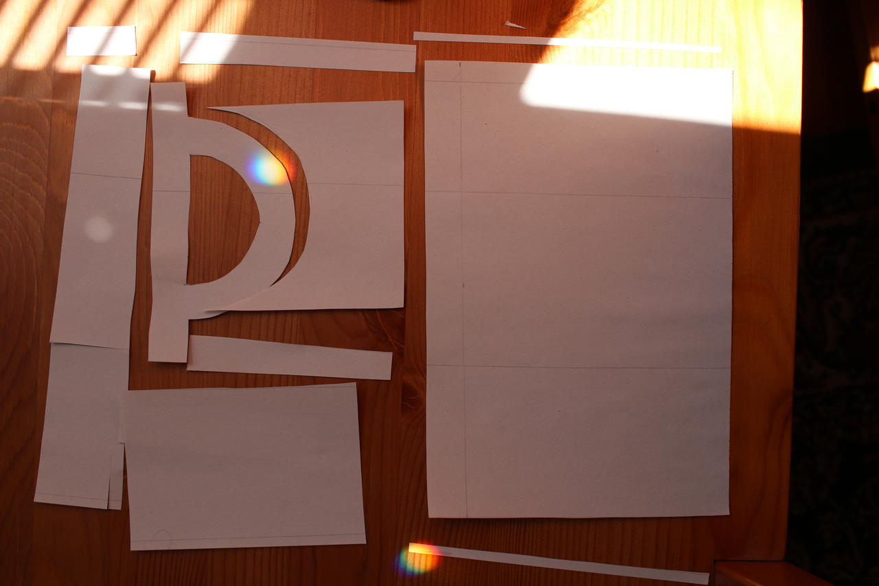
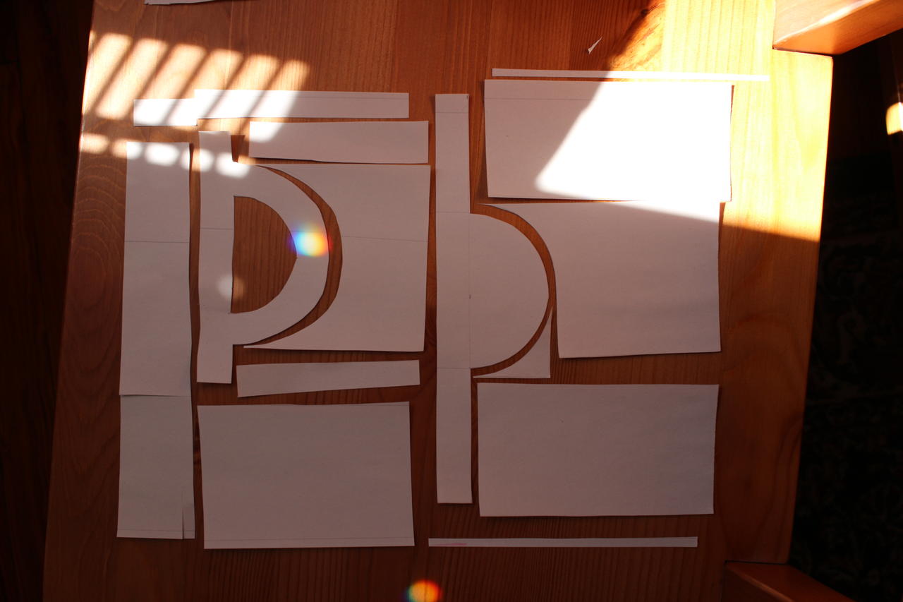
Better mark which way is up before scanning!
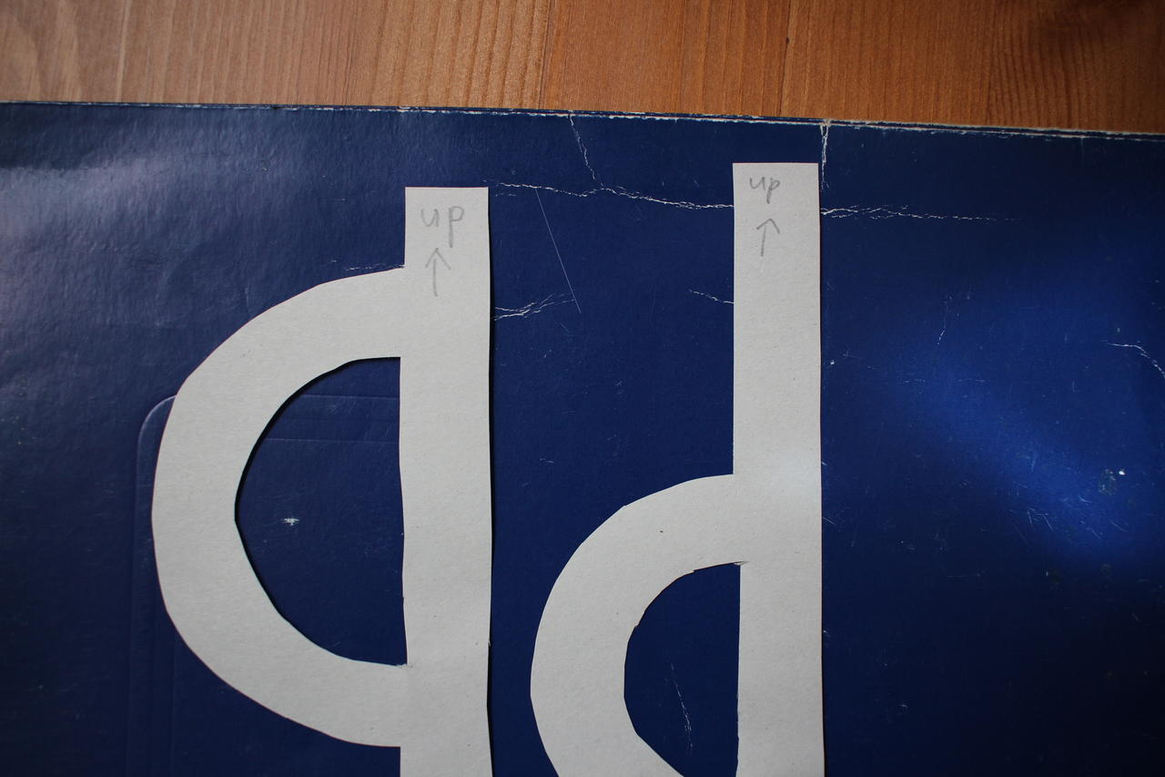
Ready to scan? (Click for 5.3 MB full-resolution image.)
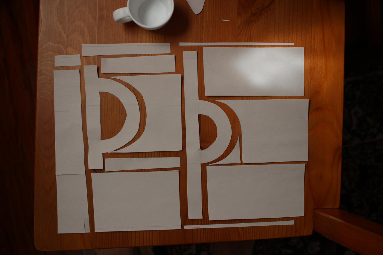
With an indication of the baseline … (Click for 5.2 MB full-resolution image.)