
See http://www.typografie.info/3/topic/35588-cutfont/
Photographed from the back to hide pencil marks.
Inverted, converted to black and white, glyphs very slightly rotated.
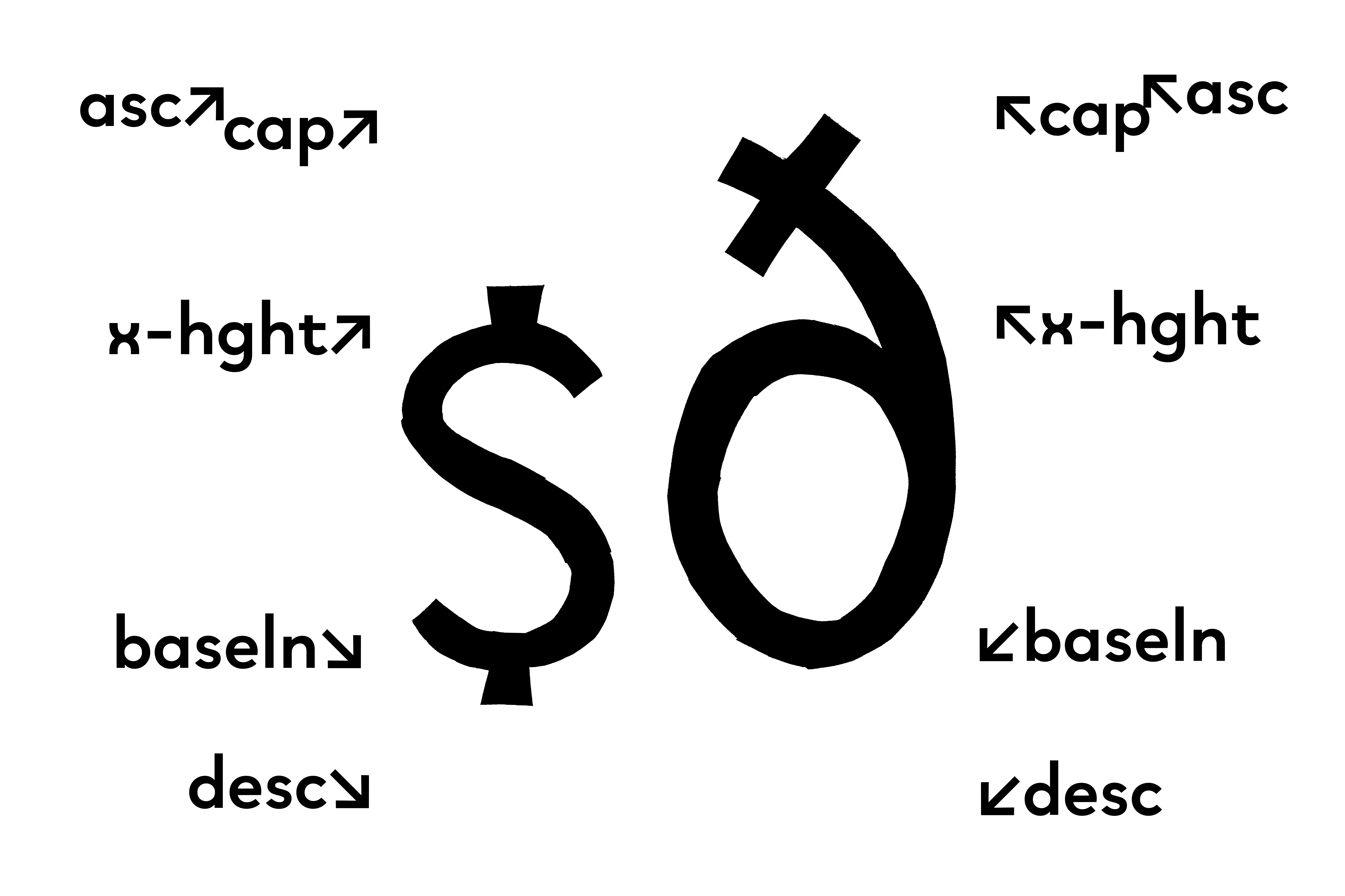
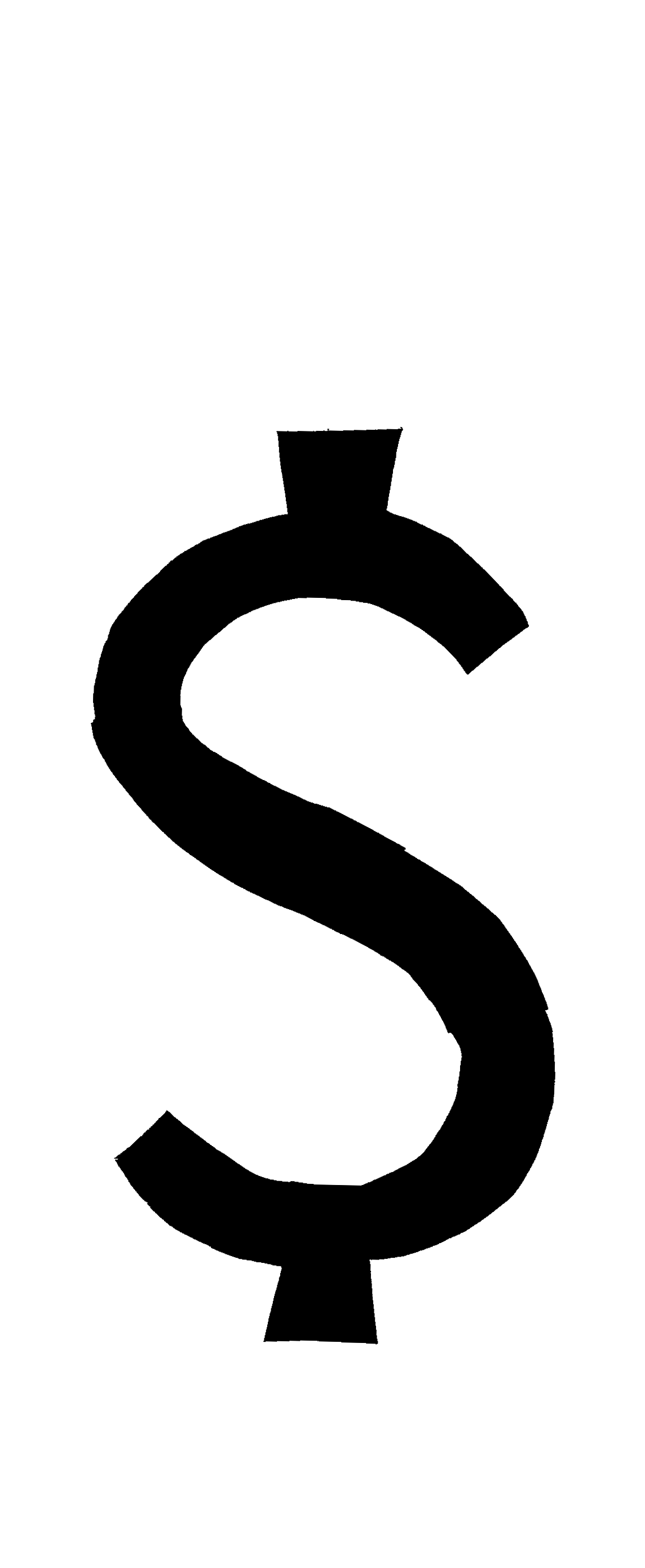
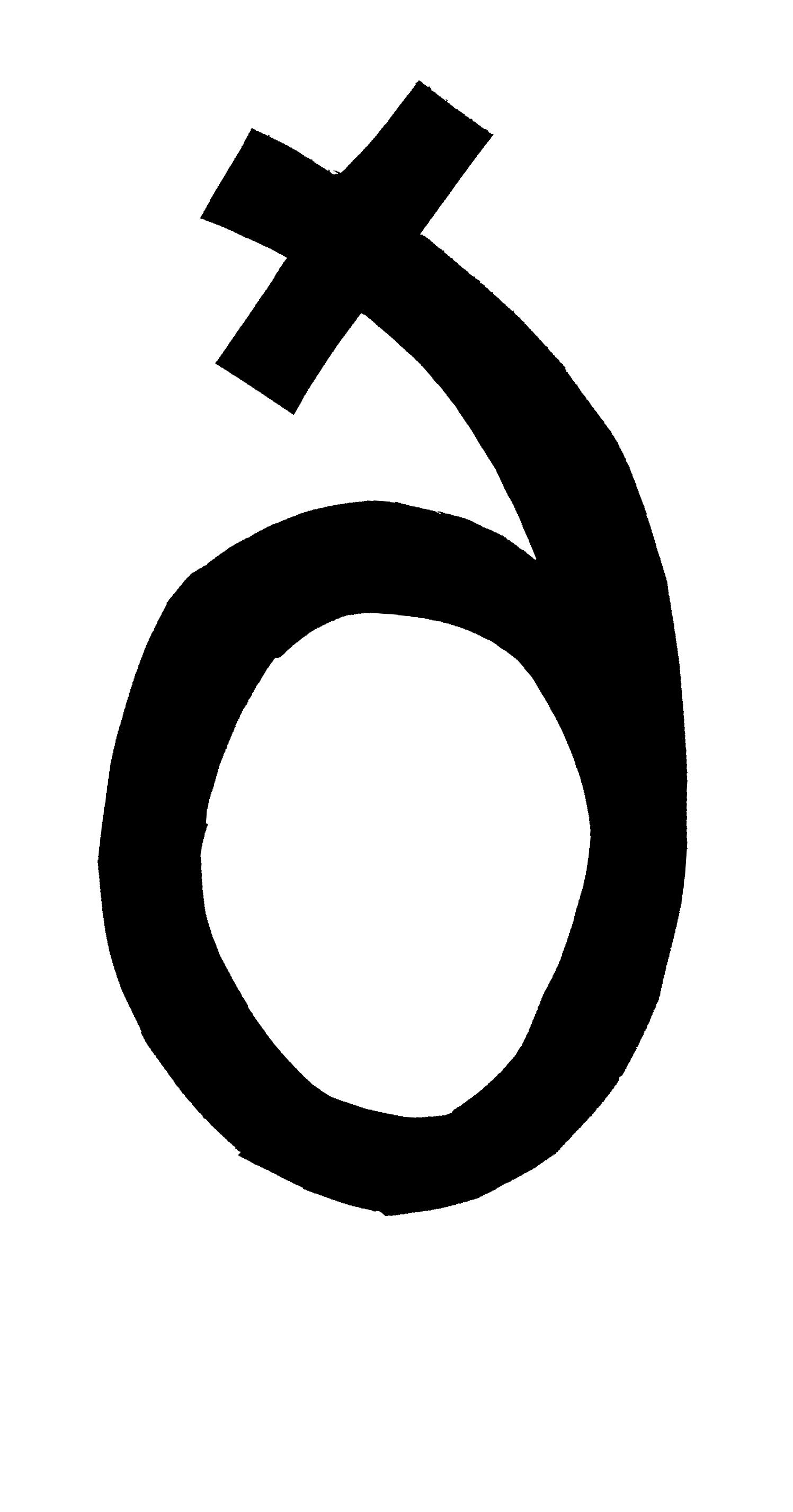
The individual glyphs. The bitmap height corresponds to the font height. No filters (e.g., for smoothing) were applied.
I deliberately did not look at my previously cut glyphs Þ and þ. After finishing $ and ð I noticed that my assumed descender was quite a bit lower for Þ and þ.